


Image and Design Blog: Photo and Graphic Tips
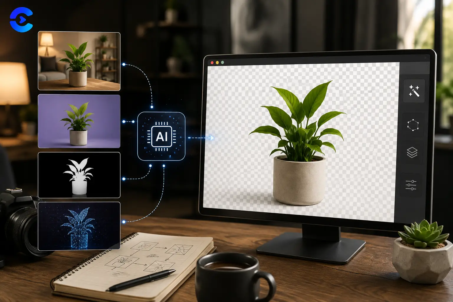
How Does AI Background Removal Work
How Does AI Background Removal Work (and Its Limits) Wondering how does ai background removal work? A model scans the image, predicts which pixels belong to the main subject, and
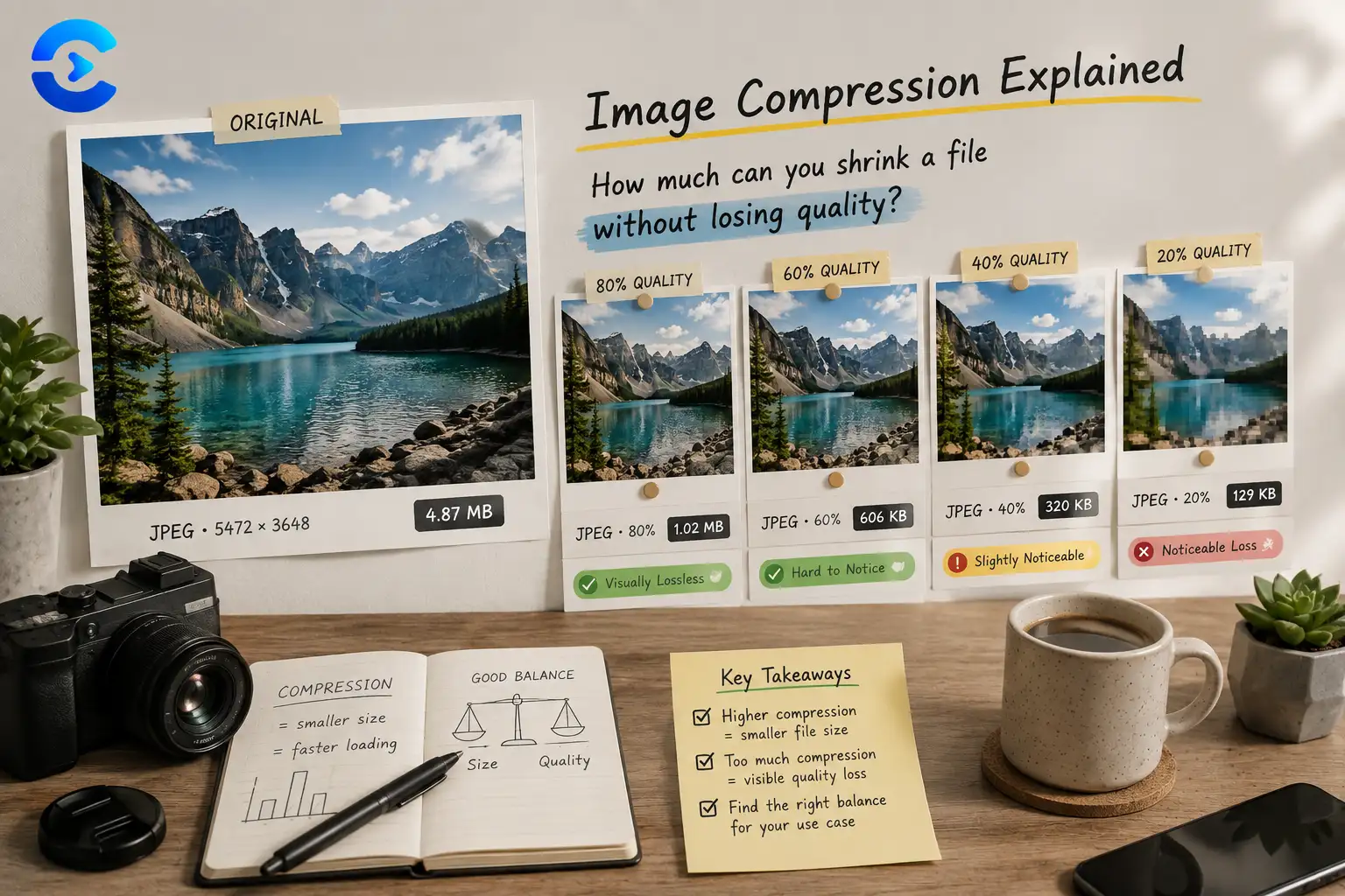
How Much Can You Compress an Image?
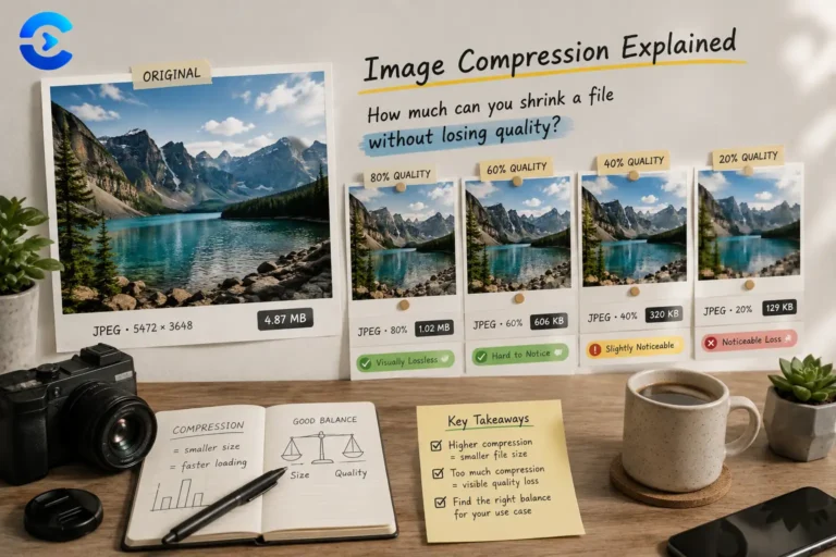
How Much Can You Compress an Image? Most photographs can be compressed to roughly 10 to 20 percent of their original file size before visible quality loss appears, though the
Accessible Color Contrast Guide for Designers
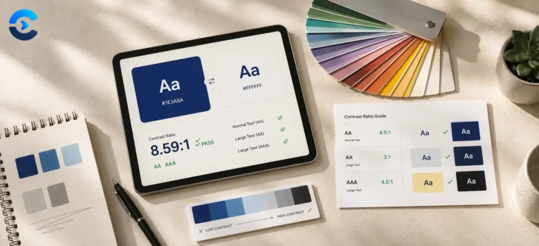
Accessible Color Contrast Guide for Designers WCAG 2.1 AA requires a contrast ratio of at least 4.5 to 1 for normal body text and at least 3 to 1 for

OCR Explained: Why Does OCR Fail on Some Documents?
OCR Explained: Why Does OCR Fail on Some Documents? Why does ocr fail on some documents? In short, optical character recognition breaks down when the source image gives it too

How Do QR Codes Work? The Reason They Rarely Fail
How Do QR Codes Work? The Reason They Rarely Fail So how do QR codes work? A QR code stores data as a grid of black and white squares that

Other Posts
Colour, compression and the decisions in between
Design tooling hides an enormous amount of arithmetic. Once you can see it, choices that felt like taste turn out to have defensible answers.
Colour is the clearest example. Hex, RGB and HSL describe the same colour in three notations, but only HSL lets you reason about it, because lightness and saturation are separate dials rather than tangled through three channels. That is why building a palette in HSL takes minutes and building one in hex takes an afternoon of nudging values.
Contrast is arithmetic too, and it is where most sites quietly fail. WCAG defines relative luminance precisely, and body text needs a ratio of at least 4.5 to 1 against its background. Grey on white looks elegant in a mockup and becomes unreadable on a phone in daylight, and the ratio tells you that before a user does.
Compression is the other half of this category. Resizing removes data before compression ever runs, which is why halving the dimensions of a photo does more for file size than any quality slider. These posts cover when to reach for JPG, PNG or WebP, what lossy compression actually discards, and where the visible quality cliff sits.
What you will find here
- Colour theory explained through the maths rather than mood boards
- Accessibility and contrast, with the pass and fail thresholds
- Format comparisons for JPG, PNG, WebP, SVG and GIF
- Compression walkthroughs showing where quality visibly drops
Questions about image and design blog
Short answers to what readers ask most about this category and the tools behind it.
WCAG AA asks for 4.5 to 1 for normal body text and 3 to 1 for large text, meaning roughly 24 pixels or 19 pixels bold and above. AAA raises those to 7 to 1 and 4.5 to 1. The Contrast Checker shows which level a pair passes, and it is worth checking placeholder text and disabled states too, since those fail most often.
JPG for photographs, PNG when you need sharp edges or transparency, WebP when you want both at a smaller size and can accept that a few older tools still choke on it. WebP typically saves 25 to 35 percent over JPG at the same visual quality, which is real money in page weight.
No. The image tools read your file through the browser file API and draw it to a canvas locally. The image never leaves your device, which matters for client work under NDA and for anything with people in it.
Because lossy compression is not repeatable. Each pass discards detail permanently and then the next pass compresses the artefacts left behind by the first. Always compress from the original, and if you need several sizes, resize from the original each time rather than shrinking a shrunk copy.
Use the Color Palette Extractor, which clusters the dominant colours and returns them as hex values. Then check every text and background pairing for contrast before you commit, because extracted palettes look great and fail accessibility surprisingly often.
No. They start from the problem rather than the theory, and where a concept like luminance or chroma subsampling is needed, it is explained in the post rather than assumed.