
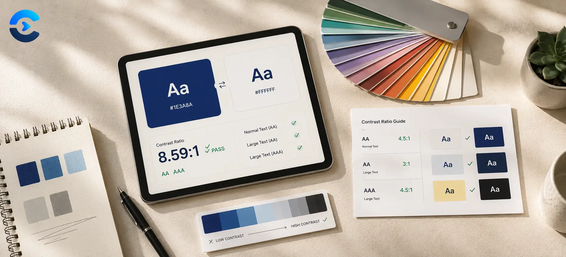

Accessible Color Contrast Guide for Designers
WCAG 2.1 AA requires a contrast ratio of at least 4.5 to 1 for normal body text and at least 3 to 1 for large text (18pt or 14pt bold and up) and UI components, measured between the text color and its background, so designers should check every text and background pairing against those thresholds before shipping a design. This accessible color contrast guide for designers walks through what those numbers mean in practice, where teams get them wrong, and how to fix a failing pairing without starting a palette over from scratch.
What contrast ratio actually measures
Contrast ratio is a mathematical comparison between the relative luminance of two colors, expressed as a number from 1 to 1 (identical colors) up to 21 to 1 (pure black on pure white). It has nothing to do with hue or how colors feel next to each other. A bright orange on pale yellow can look lively and still fail badly, while plain dark gray on white can pass with room to spare.
The Web Content Accessibility Guidelines, commonly shortened to WCAG, define minimum ratios so that people with low vision, color blindness, or who are simply reading a screen in bright sunlight can still tell text apart from its background. The official WCAG 2.1 contrast minimum success criterion is the source document most design teams point to when someone asks why a shade needs to change.
The three thresholds behind any accessible color contrast guide for designers
Level AA, the standard most companies target, sets three practical thresholds.
Normal text needs a ratio of at least 4.5 to 1. This covers body copy, captions, form labels, and most paragraph text at typical sizes.
Large text needs only 3 to 1. Large is defined as 18pt regular weight or larger, or 14pt bold or larger, roughly 24px and 18.5px bold in typical web units. Bigger, bolder letterforms remain legible at a lower ratio because the shapes are easier to distinguish even with less color separation.
UI components and graphical objects, meaning things like button borders, form field outlines, icons that convey meaning, and focus indicators, also need at least 3 to 1 against their adjacent background. This rule trips up a lot of teams because it applies even when there is no text involved at all, such as a checkbox outline or a chart line.
Level AAA, a stricter tier, bumps normal text up to 7 to 1 and large text up to 4.5 to 1. Most public facing products aim for AA rather than AAA, since AAA can be difficult to hit with a brand palette that includes lighter accent colors.
Where designers most often get caught out
Placeholder text is a classic failure point. Default placeholder gray is frequently lighter than the 4.5 to 1 threshold, especially on white backgrounds, and it is easy to forget that placeholder copy still counts as text a user needs to read.
Disabled states are another common miss. Teams often lighten a button or label to signal that it is inactive, but if any part of that state still needs to communicate information, such as a disabled price, it should stay above the ratio for its text size.
Brand colors used as body text are a third trap. A saturated brand blue or a pastel accent often looks great as a background chip but fails outright as small text on a light page. Reserve the brand hue for a bolder shade when it needs to carry text, and save the lighter tint for backgrounds instead.
Gradient backgrounds behind text deserve a second look too. A gradient built with a gradient generator might pass contrast at one end and fail at the other, so check the darkest and lightest points of the gradient separately rather than testing only the midpoint.
A quick workflow for checking contrast during design
Build the habit of checking pairings as you choose colors, not after a design is finished. Start by picking your base palette with a color picker so you have exact hex values rather than eyeballed swatches. Exact values matter because a contrast ratio calculation depends on precise luminance, and a shade that looks close by eye can be several points off in the actual math.
If you are working from an existing photo or brand asset, a color palette extractor can pull the dominant colors out for you. Once you have candidate colors, run every text and background pairing, plus every button and icon pairing, through a contrast checker before you move on to layout work.
When a pairing fails, the fix is usually smaller than it feels. Darkening the text a few percentage points, or lightening the background slightly, often closes the gap without changing the overall look of the design. Keep adjusting in small steps and rechecking the ratio rather than guessing at a completely different color, since a close near miss usually needs a nudge, not a redesign.
Contrast is only one part of accessible color use
Meeting the ratio is necessary but not sufficient on its own. Color should never be the only signal for something important, such as marking a required field red with no label, or showing an error using color alone with no icon or text. Around 1 in 12 men and a smaller share of women have some form of color vision deficiency, so pairing color with a shape, icon, or text label protects a meaningful slice of any audience, contrast ratio aside.
Testing at the actual sizes and weights your product ships is worth the extra minute too. A ratio that passes for 16px text does not automatically pass for a smaller caption elsewhere on the same screen. Once a system passes cleanly, document the approved pairings so future updates do not drift back below the threshold. You can find more practical breakdowns like this one across the ConvertNow blog, and the full toolset lives at convertnow.tools/tools.
Check any pairing in seconds
Calculating relative luminance by hand is slow and easy to get wrong. Our free Color Contrast Checker takes any two colors and tells you the exact ratio, along with whether the pairing passes AA and AAA for normal text, large text, and UI components.
Open the Color Contrast CheckerRelated design tools worth knowing
Accessible color work usually starts before you ever open a contrast checker. Pick exact hex values with the color picker so every swatch in your design system is precise. If you are pulling colors from a photo or existing brand asset, the color palette extractor gets you a starting set fast. And when a background needs to fade between two brand colors, test both ends of the fade with the gradient generator before placing any text over it. Browse the rest of the ConvertNow toolset any time you need another quick fix.
The short version
Normal text needs at least 4.5 to 1 contrast, large text and UI components need at least 3 to 1, and both numbers come straight from WCAG 2.1 AA. Check every pairing at its actual size and weight, watch for placeholder text, disabled states, and gradients as common failure points, and pair color with text or icons rather than relying on color alone. Run any pairing you are unsure about through the Color Contrast Checker before you ship.
FAQ: Accessible Color Contrast Guide for Designers
What is the accessible color contrast guide for designers in one sentence?
It means checking every text and background pairing against WCAG 2.1 AA, which requires at least 4.5 to 1 for normal text and at least 3 to 1 for large text and UI components, before a design ships.
What contrast ratio counts as accessible for body text?
Normal body text needs a contrast ratio of at least 4.5 to 1 against its background under WCAG 2.1 level AA, the standard most products target.
Why does large text only need a 3 to 1 ratio?
Larger, bolder letterforms remain legible at lower contrast because the shapes are easier to distinguish, so WCAG sets a lower 3 to 1 threshold for text at 18pt regular or 14pt bold and up.
Do buttons and icons need to meet a contrast ratio too?
Yes. UI components and graphical objects, such as button borders, form outlines, and meaningful icons, need at least 3 to 1 contrast against their adjacent background under WCAG 2.1 AA, separate from any text rule.
What is the difference between WCAG AA and AAA contrast levels?
Level AA requires 4.5 to 1 for normal text and 3 to 1 for large text and UI components. Level AAA is stricter, requiring 7 to 1 for normal text and 4.5 to 1 for large text. Most public products target AA.
Why does placeholder text often fail contrast checks?
Default placeholder gray is frequently lighter than the required 4.5 to 1 ratio on a white background, and it still counts as text a user needs to read, so it must meet the same threshold as regular body copy.
Can a gradient background pass contrast at one point and fail at another?
Yes. A gradient can pass contrast where it is darkest and fail where it is lightest, so both ends of the gradient need to be checked separately whenever text sits on top of it.
Is meeting the contrast ratio enough for accessible color use?
No. Contrast ratio is necessary but not sufficient on its own. Color should never be the only signal for something important, since color vision deficiency affects a meaningful share of any audience, so pair color with text or icons as well.
What is the fastest way to check if a color pairing is accessible?
Use a dedicated tool rather than calculating relative luminance by hand. The Color Contrast Checker linked above returns the exact ratio and pass or fail status instantly for any two colors you enter.