
Image and design tools that never see your image
Convert, compress, resize, extract palettes, remove backgrounds, read text and generate codes. All of it through the Canvas API in your own browser, with no upload step anywhere.
Image and design tools
Tools for conversion, compression, colour and generation.
Six formats, and the one question that picks between them
Almost every format argument resolves once you know whether the image is a photograph, whether it needs transparency, and whether it has to animate.
One thing that catches people out constantly. Exporting a transparent PNG as JPEG does not warn you, it flattens the transparency onto a background, usually white or black. If a logo suddenly has a white box around it, that is what happened.
What the quality slider is actually discarding
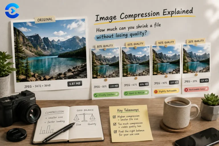
JPEG and WebP quality is not a percentage of anything. It is a knob controlling how aggressively high frequency detail gets thrown away.
The useful range is narrower than it looks. Below 60 you get visible blocking around edges and banding in skies. Above 90 the file grows steeply while almost nothing improves, because you are spending bytes encoding detail the eye discards anyway. For most web work 75 to 85 is where the curve flattens.
Two things worth knowing. Quality settings are not comparable across encoders, so quality 80 in one tool is not quality 80 in another. And every lossy save discards more, permanently, so repeatedly opening and re-saving a JPEG degrades it a little each time. Keep a lossless master and export from that.
Resizing before compressing usually saves more than any quality setting. A 4000px photo displayed in a 600px column is carrying more than forty times the pixels it needs.
Five notations for the same colour
The colour converter moves between all of these. They describe identical pixels in different vocabularies.
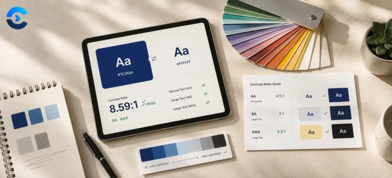
Contrast deserves a note of its own. The WCAG contrast requirement is 4.5 to 1 for body text, and it is calculated from relative luminance rather than anything you can eyeball. White text on a mid yellow looks fine and scores about 1.4 to 1, which is close to invisible for a lot of readers. The contrast checker on this page runs the actual formula.
Other categories worth a look
Every category on ConvertNow, free and growing.
Notes on images and colour
Format choices, compression tradeoffs and accessible palettes.


Questions about image and design tools
Formats, compression, metadata and where the processing happens.
Are my images uploaded anywhere?
Which format should I actually use?
Does converting remove EXIF and GPS data?
What quality setting should I pick?
Why did my transparent PNG get a white background?
Is there a file size limit?
Does compressing an image twice lose more quality?
What contrast ratio do I need to pass accessibility checks?
Your images never upload
Photos are personal. Product shots are commercial. Neither should pass through a somebody else’s server to be resized.